- November 23, 2024
-
-
Loading

Loading

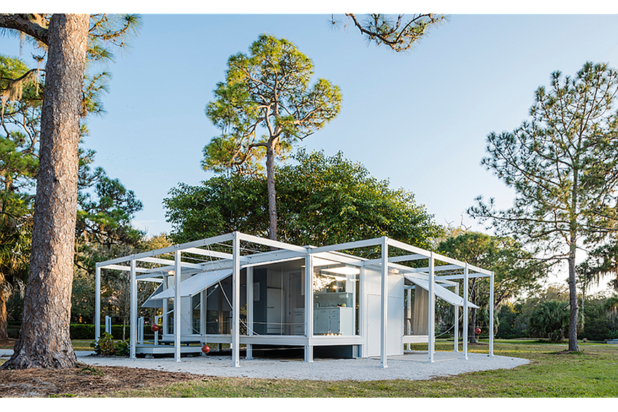
A modernist structure gleams in the sun on the grounds of The Ringling — a deceptively simple space of floor-to-ceiling glass and screens with gullwing shades that flap up and down with the aid of cannonball-like counterweights.
It’s a nearly exact replica of the Walker Guest House designed by Paul Rudolph in 1952. Architect Joe King adapted the original plans and supervised construction of the replica in 2015. By design, this outreach of the Sarasota Architectural Foundation can be dissembled and reassembled on another site. SAF plans to do just that, and send the house to another museum exhibition after April 2017.
It’s a cool concept and an impressive sight. Docent David Sadkin relates the story of a child who looked up at him with eyes of wonder and asked, “Hey, mister. Is this the house of the future?”
The answer might be yes.
The original guest house, built on Sanibel Island, was small by today’s mega-mansion standards: a 24-by-24-foot interior encompassing only 576 square feet. But dynamite comes in small packages — and revolutions do, too.
Rudolph’s futuristic structure anticipated today’s tiny-house movement and green architecture, honoring sustainable principles before the term was even coined. His principles were so far ahead of their time that we’re just now catching up to them.
It’s a small house, but it brought to life some big ideas.
Local architect Carl Abbott says there’s a clear distinction between good and bad architecture. And it boils down to thoughtfulness.
“Bad architects and builders plop down a generic box on a site without regard to the character of the land, the neighborhood or the climate,” he says. “Good architecture is never one-size-fits-all. Paul Rudolph followed that principle in every building he ever built. He set an example for all of us.”
Before air conditioning was ubiquitous, comfort was a key component of home design.
Architect Martha Kohen, a professor at the University of Florida School of Architecture and a founder of the Consortium for Hydro-Generated Urbanism, notes Rudolph’s eye for livability in his design clearly considered its subtropical climate.
“Like other early modernists, he achieved comfort through shade, cross-ventilation and elevated floor levels,” she says. “Rudolph’s solutions were just a little more ingenious.”
It’s one thing to achieve good design. It’s another to do it efficiently. Architect and inventor Buckminster Fuller had a litmus test for fellow architects.
“How much does your building weigh?” he would famously ask. It was shorthand for a larger question: Are you achieving the best possible solutions with the least amount of stuff?
John Lambie, executive director of the Florida House Foundation, says Rudolph could withstand the question.
“He used materials sparingly, and he stuck with off-the-shelf products — lumber, plywood and plate glass in conventional dimensions,” he says. “There was absolutely no waste.”
Abbott traces this efficiency to Rudolph’s background as a naval architect.
“Every element had a job to do,” he says. “Nothing went to waste. It’s the kind of design thinking you’d see in a fine yacht.”
Rudolph’s house shows you what it’s made of and how it’s put together. It’s all in plain sight, from the membranes of screen and glass to the wood framework, stabilized with tension wires. Architect Christopher Wilson, a professor of architecture at Ringling College and an SAF board member, describes the house as a simple grid system with three bays on each side. The design’s logic, he says, is immediately clear to the viewer.
Wilson describes the WalkerGuest House as Rudolph’s distillation of the essence of a house. He compares the structure to Philip Johnson’s Glass House and Mies van der Rhoe’s Farnsworth House — with one big difference.
“You could open the house up or seal it off,” he says. “Rudolph’s essential living space was not a rigid structure.”
Abbott agrees.
“It’s basically a box with hinged walls that go up,” he says. “You can close the box or open it. The concept is so simple — as simple as a toy.”
In a nutshell, the house (and its replica) was a site-specific design, using passive house technology and a cost-effective, clearly articulated scheme that users could easily modify.
It’s a fascinating slice of architectural history. And it’s a model for a sustainable architectural future. The example can be followed, as Joe King’s re-creation proves.
“This house made a big splash when it first came out,” says SAF board chairwoman Janet Minker. “McCall’s ran a color spread. I know it had an influence on the architects of the time. I hope what we’re doing here will have the same kind of impact.”