- April 29, 2025
-
-
Loading

Loading

For most people, remodeling a home is a stressful ordeal. Things go wrong with the plumbing. The contractor vanishes for days at a time. It turns out you don’t like that very expensive farmhouse sink as much as you thought you would. It’s enough to dampen the enthusiasm of any homeowner.
And then there are those lucky few for whom remodeling is an adventure. They are the fearless ones who look upon the process as an exciting challenge. They educate themselves online, visit all the stores and showrooms, consult with experts when necessary but still manage to keep the vision uniquely their own.
Mary anne Morrison is one of the adventurers. Over the years she’s discovered how to do it. Her secret is something she was born with — a sure sense of taste — but she admits it’s more than that.
“I love the hunt,” she says with a gleam in her eye. She pores over all the websites, both high and low. And if she finds the best product at Home Depot, such as the blackout shades in the bedrooms, then Home Depot gets the business.
Morrison’s skills are on view in a condo in Clubside in Country Club East. She and her husband, Dave, purchased it as a replacement for their 3,600-square-foot home in The Lake Club. A change in lifestyle meant they would be spending more time at their home in Canada and their condo in Mexico. Clearly, a smaller Florida home was in order.
The couple found the perfect place: a three-bedroom, ground-floor unit of just more than 1,700 square feet overlooking a peaceful water view. The interior was suitably solid and conventional. But Morrison didn’t want conventional and thus began her latest adventure: transforming a builder’s model into a sensational getaway home full of luxury and a heavy dose of glamour.
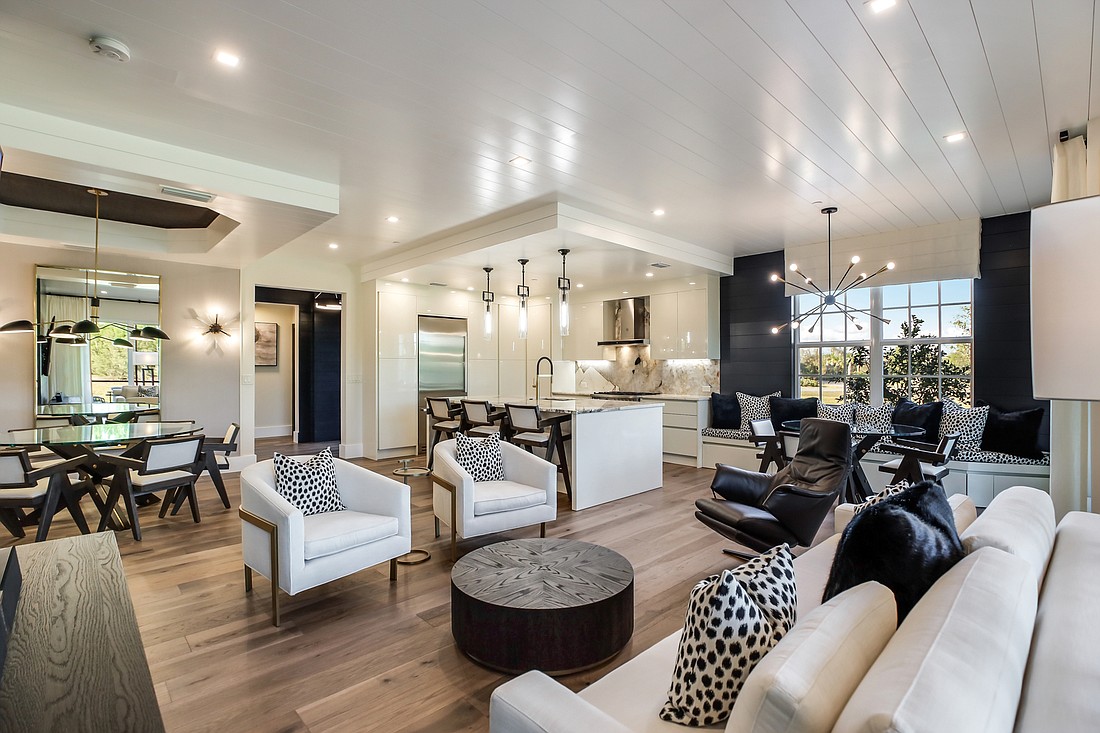
The inspiration for the new home’s makeover came from an extraordinary piece of granite and quartz Morrison found at The Granite Place on U.S. 301. Its color scheme — white and black with subtle streaks of gold — provided just the right amount of drama to transform the main living area.
The Morrisons reconfigured the space to customize it for the entertaining for which they are well known. Dinner parties for eight or 10 friends are their specialty. “People call me ‘Julie the Cruise Director,’” Morrison says, adding, “If you come to one of my parties, you’re going to play games and dance.” Her secret? “Prepare everything in advance. It’s all about being ready.”
The kitchen has a high-style European look, accentuated by the Bertazzoni appliances Morrison came across on Wayfair. Italian Interiors, a local custom cabinetry firm, helped her put together the sleek assembly of handleless, lacquered cabinets and carefully thought-out storage.
The living area, an open plan of kitchen, formal dining, informal dining and formal “living room,” has a crisp, modern style, with black and white predominating. There is abundant seating for guests, and the several dining options not only include a large round table and a smaller table adjacent to the kitchen, but through a sliding glass door you’ll also find a screened lanai, chicly outfitted in gray patio furniture.
Most of the furniture in the living area come from Restoration Hardware, Morrison’s favorite store. She shops both online and in person and found several key pieces, including the large mirrors that amplify the space surrounding the dining table, at the company’s outlet store in Clearwater.
The home is full of unexpected touches. The air conditioning outlets are covered with minimalist vents, the handiwork of local Mennonite crafters. And shiplap is everywhere, looking, in this case, like urban sophistication rather than anything vintage or rustic. It is subtly employed to define areas and add visual interest. Much of it is painted a deep onyx black, a daring touch with a big payoff. The dark hue changes and shifts tone with the light.
Another unexpected element comes from the extensive use of wallpaper. Most rooms are covered with either wallpaper or wall covering, and the technique brings a highly effective texture to the spaces. Even the laundry room has a glamorous look thanks to the slightly iridescent coverings. It didn’t hurt that a good friend of the Morrisons owns JF Fabrics and supplied his products at cost. Morrison is fussy about every detail, and that includes price.
A tour of the home discloses two guest bedrooms, one serene and one a little cuter for visiting granddaughters. But the master suite is nowhere to be seen — until you learn the secret. It seems that as originally configured, the entrance to the master suite was taking up important space in the living area. Norman Stoehr, an architect with Westwater Construction who served as contractor for the renovation, came up with a most unorthodox solution. He transferred the door to the far corner of the living room but made it so unobtrusive that it reads as panel in the wall. There isn’t even a doorknob.
The surprise entrance reveals an even bigger surprise. The master bedroom and master bath have merged in an unusual way. A glass wall separates them, but they remain one large space, a glamorized Zen version of spa and sleeping.
Here, the wallpaper, in a stylized art deco pattern, unites the space and provides a dramatic backdrop for the black stand-alone tub and the 6-foot-square shower, with porcelain tile that mimics marble. The double vanity was another Restoration Hardware find.
The Morrisons love their “tiny townhouse,” but the realities of a post-pandemic world have made their three-country lifestyle no longer feasible. They are putting their Clubside condo on the market, giving a lucky new owner the chance to enjoy the extraordinary fruits of Morrison’s taste and talent, with every detail adding up to a jewel box ambiance of luxury and glamour.