- July 11, 2025
-
-
Loading

Loading
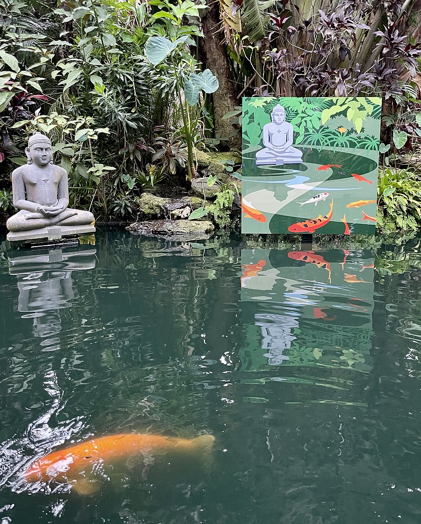
If you've ever wanted to meditate on the meaning of the word "meta," look no farther than Marie Selby Botanical Gardens.
There you will find suspended above the koi pond with a statue of the Buddha a large aluminum reproduction of artist John Pirman's illustration of the same scene.
Life imitates art imitates life. (Breathe.)
Meta, in case you don't know, isn't just a hipster term that Facebook founder/ CEO Mark Zuckerberg decided to adopt as the name of his company.
It means the thing is about the thing, the way that the hit musical "A Chorus Line" is about dancers trying out for a Broadway show. Or Fellini's "8-1/2" is about a philandering auteur who hits a psychological roadblock on the film he's making.
"Koi Pond" isn't the only meta image in Pirman's show, which runs both inside and out at Selby Gardens through Sept. 17. That's not surprising because many of the transplanted New Yorker's illustrations of Sarasota are iconic.
You don't have to be a weatherman to know that morning is the best time to visit Selby Gardens at this time of year. Pirman wisely suggests meeting at 10 a.m. on a recent Sunday morning to see his show, "John Pirman: Diving into Nature."
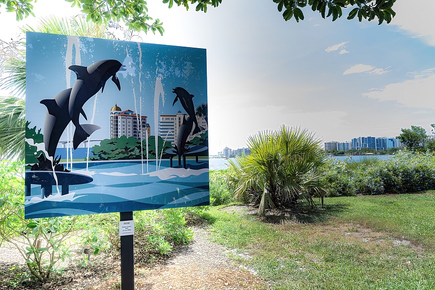
Although the aluminum images outdoors won't wilt in the face of tropical temperatures and lush greenery, any of Pirman's paper artworks would. Fortunately, they are on display inside Selby's air-conditioned gallery.
As we walk in the door and Pirman identifies himself to the museum volunteer checking tickets at the entrance, she exclaims without prompting, "Everyone who comes here leaves happy."
As they should. Pirman's world is populated with happy families on vacation, mid-century modern design, swimming pools and technological conveniences like TV dinners and online shopping sites. Life is good.
Pirman attributes the optimism of his art, whether personal or commercial, to sunshine. (Did he see the Anita Bryant commercial in the 1970s for Florida orange juice?) But his New York winter scenes on holiday cards and shopping bags are also full of magic. They leave you feeling like a child who has just shaken up a snow globe.
As one views the evolution of Pirman's work over the years it's apparent that a talented boy was encouraged in his artistic ambitions by parents and teachers.
The first thing a visitor sees in the show is a cut paper work featured in a school showcase when Pirman was in kindergarten. Next to it is his first published drawing, in Highlights For Children, when he was 8 years old. "Those early artistic successes brought me confidence," he recalls.
If there was ever a poster child for elementary arts education, Pirman is it. But his artistic training also began at home, where he was exposed to the skills of his father, who was a mechanical draftsman, and his uncle, who was a package designer.
In the suburb of Akron, Ohio, where Pirman grew up, people went to work to make things with their hands and with machines. Computers were still in the future.
Born in 1956, Pirman came of age during a sweet spot in American history, a time when there was money and leisure for family vacations, and where TV and travel were opening up new vistas to middle-class denizens of the Midwest like Pirman and his peers.
One of the sunny images in the Selby gallery is a giant snapshot of Pirman's family in bathing suits at a motel in the Smokey Mountains, where they stayed on their way to vacation in Treasure Island, Florida.
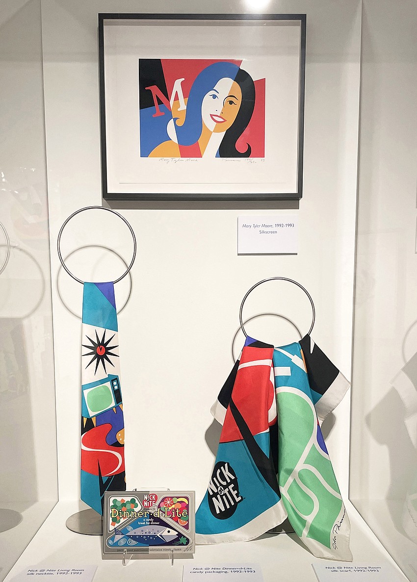
It's fitting that Pirman was tapped to create branding material and merchandise for "Nick at Nite" in the mid-1990s. He watched the programs from the golden age of TV like "The Mary Tyler Moore" show that were repackaged into a cable channel. Surely, Moore would adore the glass case where her smiling face is featured on Pirman's "Nick at Nite" merch for sponsors.
But in addition to having the luck of a supportive family and living in an era of great prosperity for many, Pirman is a man in step with his time and his place. His New York work emphasizes fashion and shopping, first at department stores such as Bloomingdale's and later at pioneer online retailer Bluefly.
After visiting Siesta Key over the years and deciding to move to Sarasota in 2008, he was immediately adopted by his new hometown. Pam Daniel, then managing editor of Sarasota Magazine, commissioned Pirman to create pictures for the last page of the magazine after he presented his work to her over lunch.
Thanks to his magazine gig, Pirman's images of familiar places like Selby Gardens' Spanish Point campus, the Dolphin Fountain in Bayfront Park and the cast-bronze replica of David in the Ringling Museum courtyard have become synonymous with Sarasota.
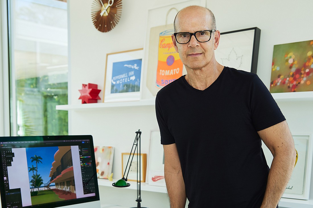
Pirman fits right in in his adopted hometown. He's friendly, polite and knows how to protect his privacy as well as those of his clients. He declined to be interviewed at his home in Indian Beach-Sapphire Shores, not far from the Ringling Museum, but came through with the helpful substitution of a guided tour.
Those who want a sense of Pirman's taste in home decor can get a clue from artwork of his New York City apartment that he used on a Museum of Modern Art Christmas card. (You guessed it: It's mid-century modern.)
You won't catch Pirman giving out the address of the area home with poodles sitting beside the swimming pool that is part of his Selby Gardens show. But he makes small talk with a gallery visitor who seems to know the former owner of the house.
Asked to describe his artistic process, Pirman says modestly, "I see things in shapes of color." That hasn't changed over the years.
What has changed is that Pirman no longer uses pieces of colored paper, vellum, a pen and an Exacto knife to create artwork. He started using computers in the 1990s and now "paints" with a Mac and the Adobe Illustrator software program.
Some of Pirman's work hanging on the walls in the Selby gallery was stored in a portfolio box for 30 years before his show. The treasure trove includes art inspired by his grandmother's backyard.
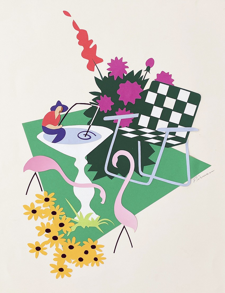
Called "Backyard Birdbath," it shows a green-and-white web lawn chair that is instantly recognizable to Americans who lived in the 1960s. The cut paper work was created for Hopper Paper in 1992.
In his low-key way, Pirman radiates pride. He's happy to reminisce about his years in New York City with a fellow veteran of those heady days of magazine publishing.
It was a time when an aspiring illustrator made appointments with magazine art directors and presented his portfolio on Fridays. "That's the way it was done," Pirman says.
It's the way future pop art superstar Andy Warhol got his foot in the door of Glamour magazine with a now famous illustration of women's shoes.
As Warhol demonstrated during his life, there's a fine line between being a graphic artist and a fine artist. Certainly, Pirman has crossed the line and will continue his journey.
"I don't like it when they call it a retrospective because I'm not done yet," he says. It's the only thing close to a complaint that you will hear in an hour's conversation.